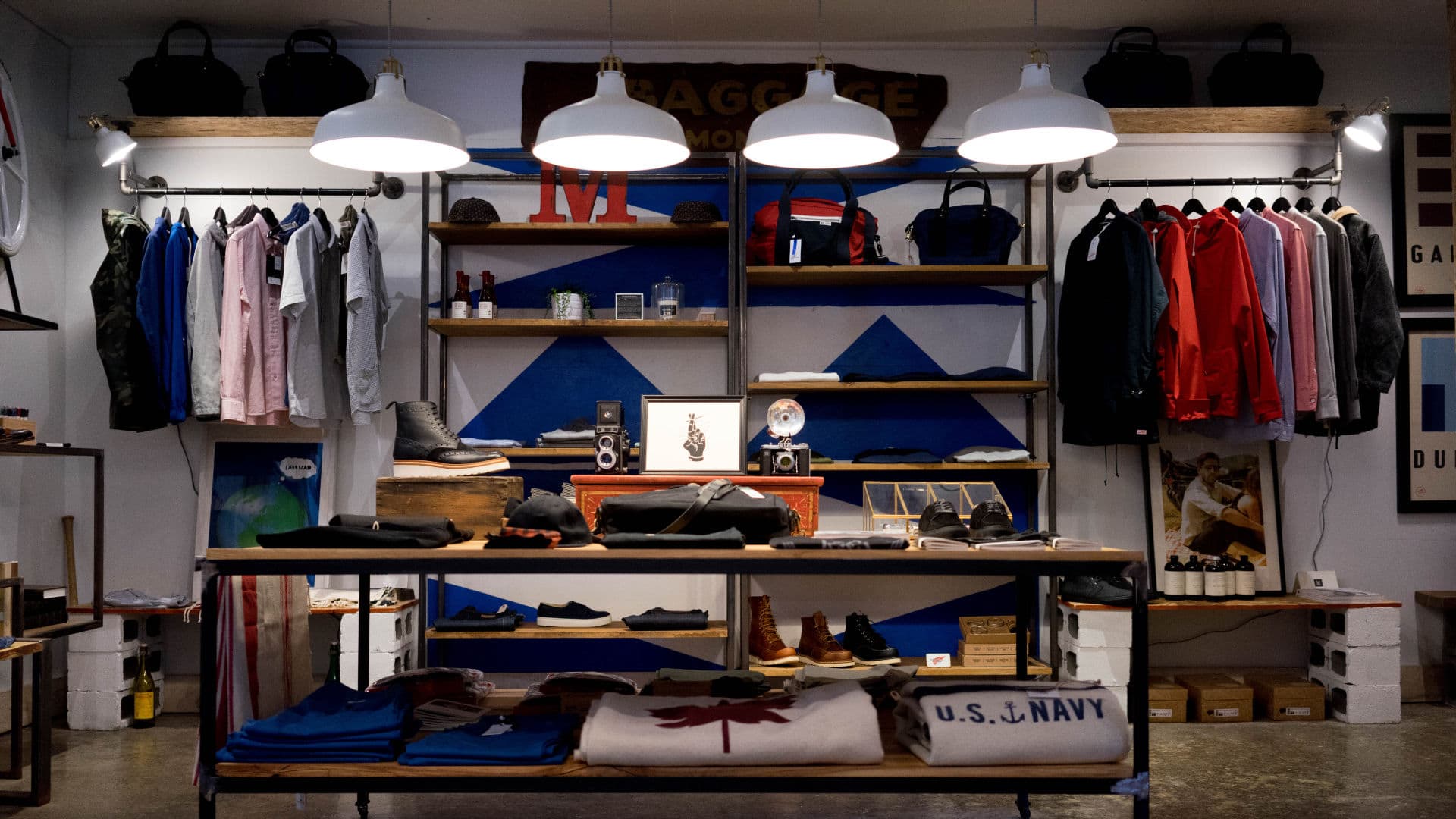
Aside of the Header Element the entire home page content is built with the Block Editor ( a.k.a. Gutenberg). Combined with GeneratePress editor styles we now have a much better front end representation whilst we are editing. Allowing each element to be given specific styles and Additional CSS classes means we don’t have to stray into HTML very often. In fact on this Site we never do.
Page Structure
Let’s begin with looking at the hierarchy.
- Header Element – This is covered in this article
- H2 Headings
- Shop Categories
- Latest Products
- Call to Action Row – forty / sixty split
- Call to Action Row – sixty / forty split
- Sale Products
- Sign Up
- GP Footer – The default Theme widgets
H2 Headings
For our landing page I wanted some big bold H2 headings. Larger than what we have specified in our Customizer. But also make them super responsive. To make this happen I created some custom CSS using an Additional CSS Class of:
large-heading
Simply select your Heading Block, make sure it’s a H2, open the Advanced Dropdown in the Settings Sidebar and add the class to Additional CSS Class field. Please note: You won’t see the style change in the editor. Like all CSS you will find it in the Customizer > Additional CSS. It looks like this
h2.large-heading {
    font-size: calc(28px + (86 - 28)*(100vw - 400px)/(1600 - 400));
    line-height: 1.1em;
}
So this looks complicated but is what provides the responsive controls. If you want more information on what this all means then check out Responsive And Fluid Typography With vh And vw Units
Shop Categories
Built using a Columns Block set to two columns. Each column contains an Image, Heading, Text and link block. Nothing fancy and real simple to edit. Adding additional columns can be done from the Column Settings. Creating additional rows is simply a case of duplicating the existing one.
Making the image link to the category
Images Settings have a Link to Option. Just set the Link to: Custom URL and add your category link
Custom Link Styling
Hopefully you noticed the custom style link. This is achieved using custom CSS. To add this style to any of your in content links just give the block an Additional CSS Class of: loud-link
Latest Products
After our Title Block we simply add a Woocommerce: Recent Products Shortcode.
Call to Action (CTA) Rows
Once again the Columns Block comes into play. Out of the box there is no way to adjust the column widths. So within the editor you’re stuck with equally sized columns. To get around this to display unequal sized columns we added some simple CSS Classes.
| Additional CSS Class | Resulting style |
| forty-sixty-columns | a 40% / 60% two column row |
| sixty-forty-columns | a 60% / 40% two column row |
| mobile-column-reverse | Reverse the order of the two columns on mobile. Add this class along with one of the above. |
Please note: these classes do not apply the styles within the editor
Sign Up
The Sign Up form is provided by the Happy Forms plugin. The form is added to the second column using a Short Code widget. The short code for your form is found in the Dashboard > Happy Forms. A common design is to use these types of CTA to break up a page. To do this we have given it our own special styling.
First off we need to make this row extend to the edge of the container ( outside of the content padding). This is done simply by selecting the Align Wide option from the Block toolbar. The rest requires some familiar CSS from our CTA Rows and a little extra. here are the classes it uses:
- sixty-forty-columns
a 60% / 40% two column row - column-banner
this makes necessary padding adjustments - center-vertical
vertically centring any content placed within one of the CTA Columns - bg-grey
Applies the grey background color
Editing the Form
The form can be edited from the Dashboard > Happy Forms. If you create a new form you will need to update the short-code used on the front page.
Changing the rows background color
Go to the Customizer > Additional CSS ( or to your Child Theme Style sheet if you have moved it). And edit this CSS:
.bg-grey {
    background-color: #f2f3f4;
}
You can of course simply create your own classes with more relevant names for the colors you choose.
Can i use a different form?
Of course. If you want to use another form plugin then simply go about setting that up and replacing the short code with your new one.


